Verdant UI - Premium React Components Library for React 19 and Tailwind v4
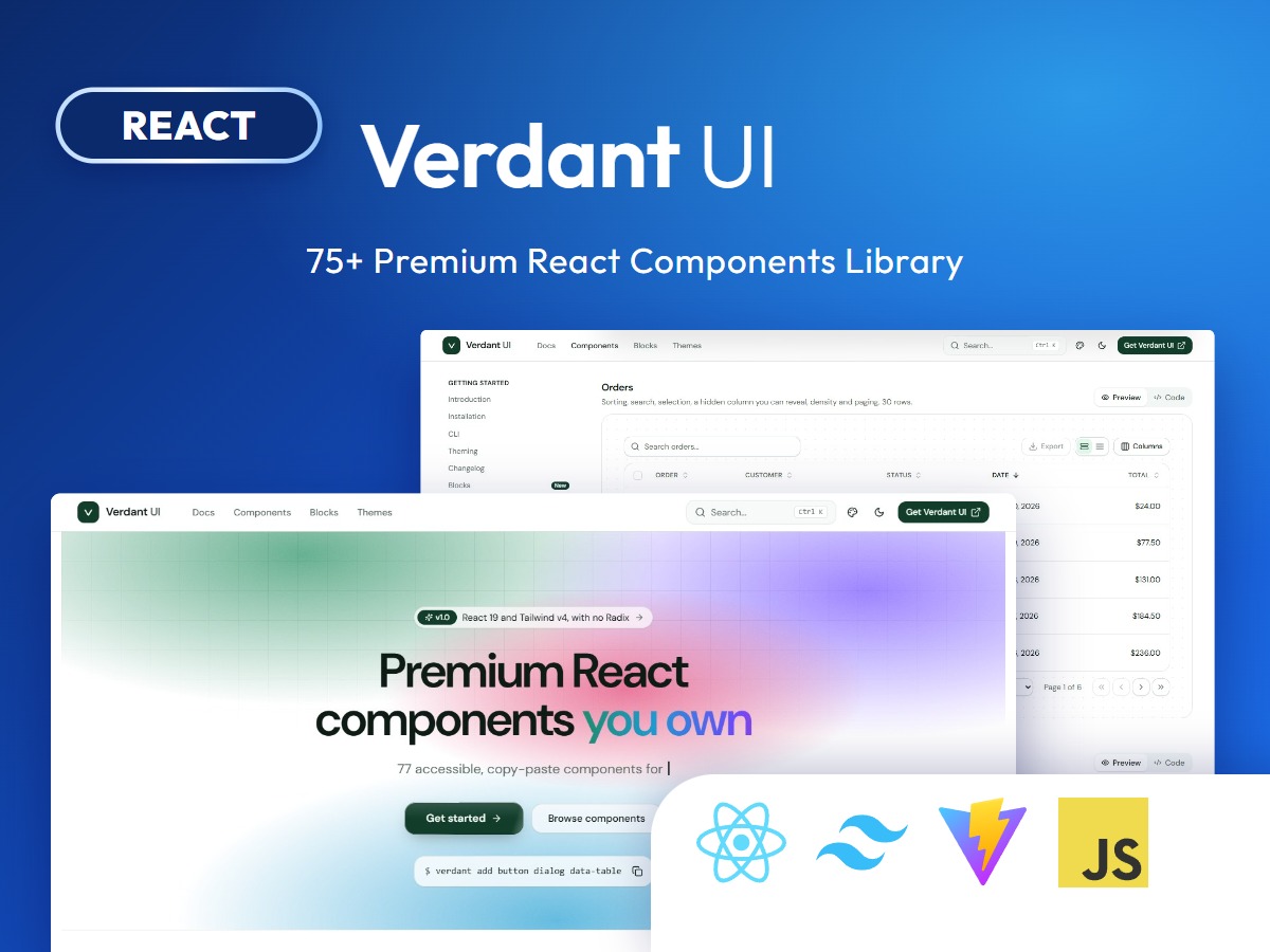
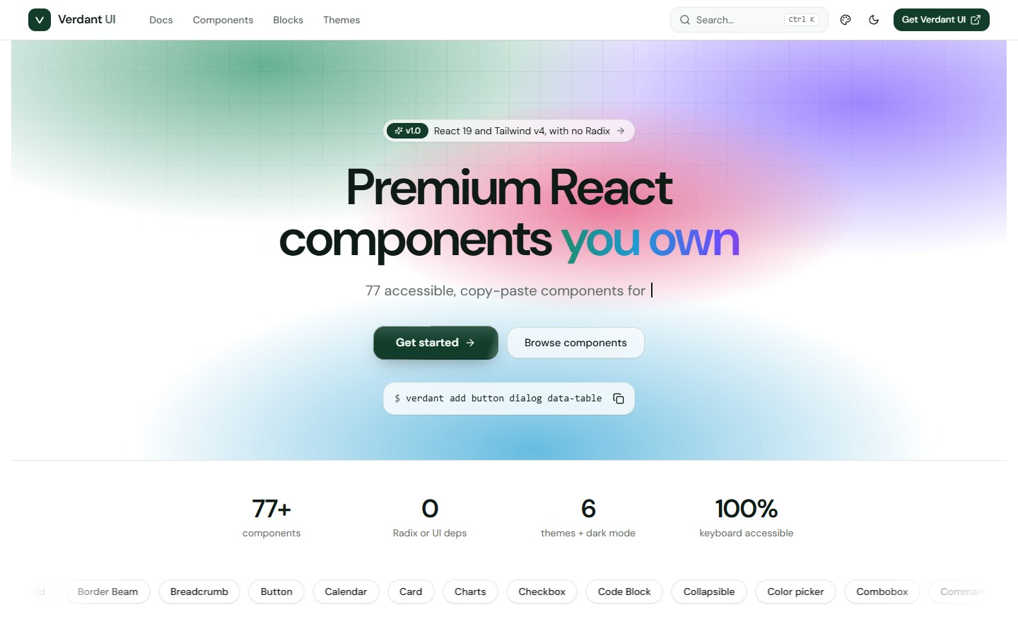
Verdant UI is a premium, copy-paste React component library for React 19 and Tailwind CSS v4. It gives you 77 accessible components, a command line tool, six themes with dark mode and a documentation site, and you own every line of source. There is no Radix and no animation library: menus, dialogs, selects and tooltips are built on a few small primitives that live in your own project.
Want to try it first? Open the live demo, press Ctrl K to search, and switch the theme and dark mode in the header.
What you get
- 77 components across inputs, forms, overlays, navigation, feedback, data display, layout and signature effects.
- Components you own: copy a file into your project and edit it. No package to upgrade, no black box.
- Zero UI-library dependencies: only clsx, tailwind-merge, class-variance-authority and Lucide icons.
- Accessible by default: WAI-ARIA patterns, roving focus, typeahead, focus traps with focus restore, live regions and reduced-motion support.
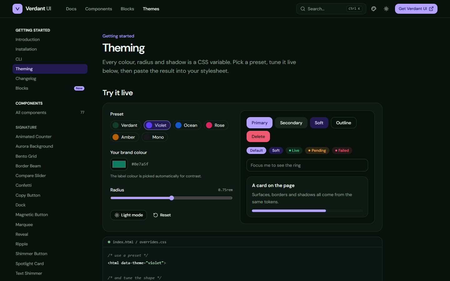
- Six themes and dark mode, all driven by CSS variables, with a live theme editor in the docs.
- A dependency-free CLI that copies a component with every helper and package it needs.
- Controlled and uncontrolled state,
asChildon triggers and buttons, and ref as a normal prop in React 19.
Every component
- Inputs (20): Button, Input, Textarea, Checkbox, Radio Group, Switch, Slider, Select, Combobox, Number Input, OTP Input, Tag Input, Rating, Color Picker, File Dropzone, Calendar, Date Picker, Segmented Control, Toggle, Toggle Group
- Forms (2): Field with label, description and error wiring, and Label
- Overlays (9): Dialog, Alert Dialog, Drawer, Popover, Tooltip, Hover Card, Dropdown Menu, Context Menu, Command palette
- Navigation (8): Tabs, Accordion, Collapsible, Breadcrumb, Pagination, Stepper, Navigation Menu, Menubar
- Feedback (6): Alert, Toast, Progress, Skeleton, Spinner, Empty State
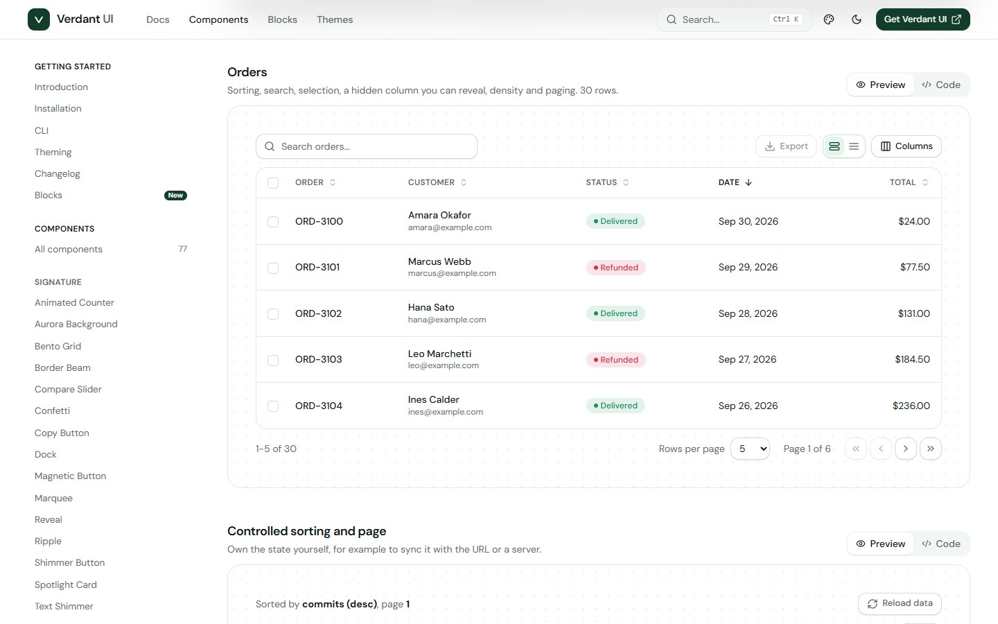
- Data display (11): Table, Data Table, Charts, Kanban board, Stat Card, Timeline, Pricing Card, Avatar, Badge, Kbd, Code Block
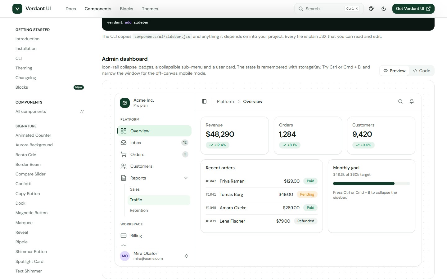
- Layout (4): Card, Sidebar, Scroll Area, Separator
- Signature (17): Spotlight Card, Tilt Card, Magnetic Button, Dock, Bento Grid, Compare Slider, Marquee, Typewriter, Text Shimmer, Aurora Background, Border Beam, Confetti, Ripple, Shimmer Button, Animated Counter, Reveal, Copy Button
Signature components
The pieces most UI kits do not have, all dependency-free and keyboard accessible.
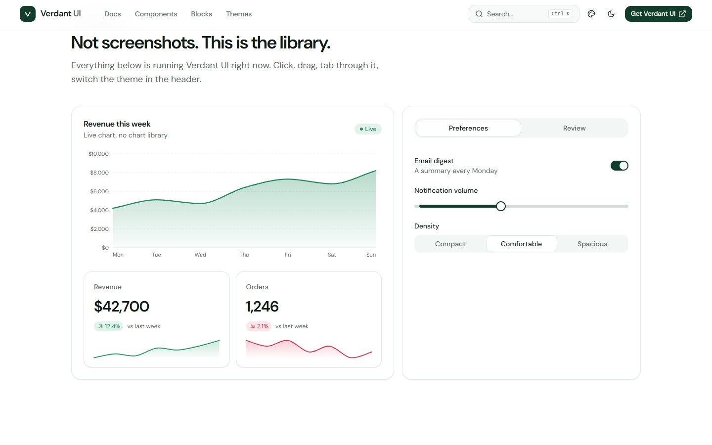
- Data Table with three-state sorting, search, column visibility, row selection, pagination, density and loading states.
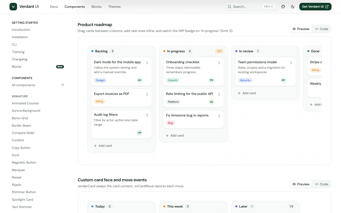
- Kanban board with pointer drag and drop, auto-scroll and a full keyboard flow with spoken announcements.
- Command palette with fuzzy ranking, highlighted matches, groups and a modal version.
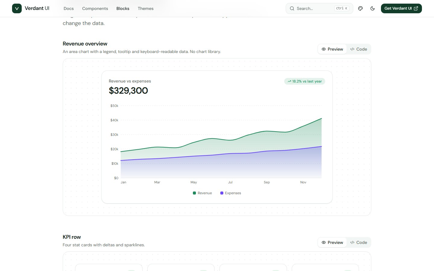
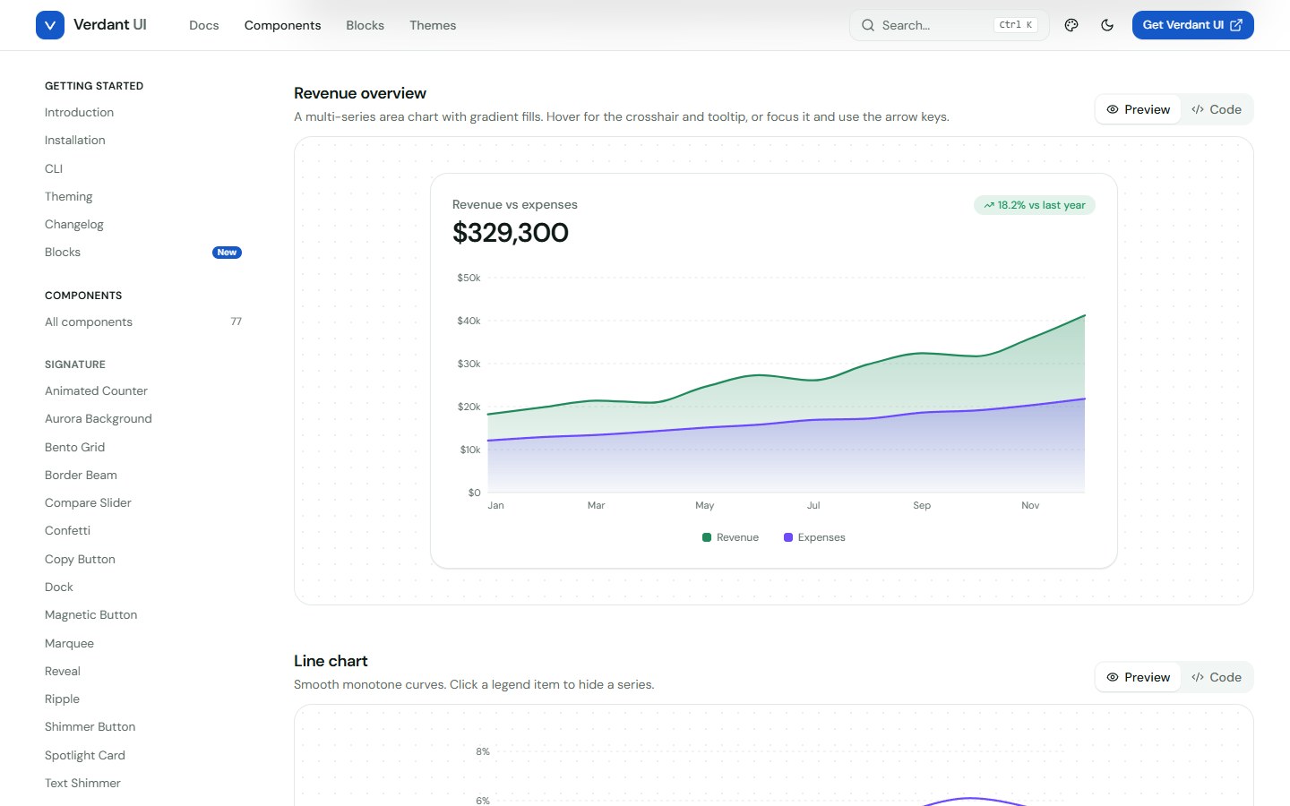
- Charts: area, line, bar, donut and sparkline in plain SVG, with tooltips and keyboard reading.
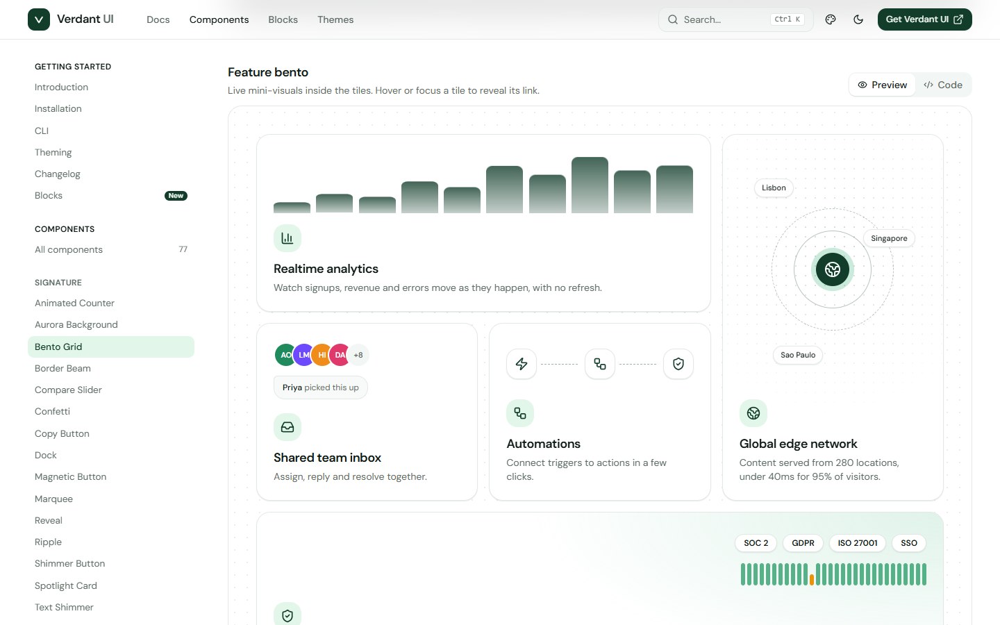
- Dock, Tilt and Spotlight cards, Border Beam, Compare Slider, Confetti and the other effects, with static fallbacks for reduced motion.
The CLI
Run npm link once inside the download, then use it in any project.
verdant initcreates the config, thecn()helper and the theme file.verdant add button dialog data-tablecopies those components, everything they import and any missing npm packages.verdant add --all,verdant listandverdant diffdo what they say.--rscadds"use client"for the Next.js App Router.
The CLI reads the registry folder shipped in the download, so it works offline. Prefer no tooling? Every component is one file you can copy by hand.
Docs, blocks and theming
- A documentation site with a live preview, copyable code and an API table for every component. The download includes its source, with a View source button on each page.
- Eight ready-made blocks: revenue overview, KPI row, orders table, pricing section, sign-up form, roadmap board, checkout wizard and verification code.
- A theming page with six presets, a brand colour picker, a radius control and the CSS to paste into your project.
Built with
- React 19 and Vite 7
- Tailwind CSS v4 with design tokens for colour, surfaces and radius
- Plain JSX: there are no TypeScript types in the download
- Lucide icons, clsx, tailwind-merge and class-variance-authority
Get started
- Unzip the download and open the folder in a terminal (Node.js 20.19 or newer).
- Run
npm installand thennpm run devto browse the docs and every component locally. - Run
npm link, thenverdant initandverdant addinside your own React and Tailwind project. - Import the theme file after Tailwind in your main stylesheet and start using the components.
Using Next.js, Remix or Astro? Add the @ import alias and, for the Next.js App Router, run verdant init --rsc. The docs cover each step.
Good to know
Verdant UI needs React 19 and Tailwind CSS v4, and it is written in JavaScript rather than TypeScript. The components were exercised in a real browser while they were built, but please run your own accessibility and browser checks for your product. A few effects, such as Border Beam, rely on newer CSS and hide themselves in older browsers. Avatars in some demos load sample photos from pravatar.cc, and every avatar has an offline fallback. The live demo shows usage snippets only; the full component source is in the download.
What is included
- Full source for 77 components, the shared primitives and the hooks
- The documentation and demo site, including the blocks and the theme editor
- The CLI and a prebuilt registry
- Vite and Tailwind configuration with a lockfile for repeatable installs
- A README with setup, theming and CLI reference
Icons and fonts
Icons come from Lucide under the ISC licence. The docs font, DM Sans, comes from Google Fonts under the SIL Open Font License.
See the license terms for what the Regular and Extended licenses cover.
- 77 accessible components: inputs, forms, overlays, navigation, feedback, data display, layout and signature effects
- No Radix and no animation library: portals, positioning, focus traps and presence are built in and live in your project
- Data Table, Kanban board with keyboard drag and drop, Command palette and dependency-free SVG charts
- Signature effects: Dock, Tilt and Spotlight cards, Border Beam, Compare Slider, Confetti, Marquee and more
- Six theme presets plus dark mode, driven by CSS variables, with a live theme editor
- Dependency-free CLI that copies components with everything they need, including a Next.js App Router option
- Controlled and uncontrolled state, asChild support and React 19 ref props
- WAI-ARIA keyboard support, visible focus rings, live regions and reduced-motion handling
- Docs site with live previews, copyable code, API tables and eight ready-made blocks
Reviews
No reviews yet. Be the first to review this product!
Questions & answers (0)
Sign in to ask a question.
No questions yet. Be the first to ask!