Northwind Goods - React Ecommerce Storefront Template
Northwind Goods is a complete, modern storefront front end for React. It gives you ten finished pages, a persistent cart and wishlist, a validated checkout and an accessible product quick-view modal, so you can start from a real shop instead of a blank project.
Want to try it first? Open the live demo and add something to the cart, use quick view, or place a test order.
What you get
- Ten pages covering the whole shopping journey, from the home page to order confirmation.
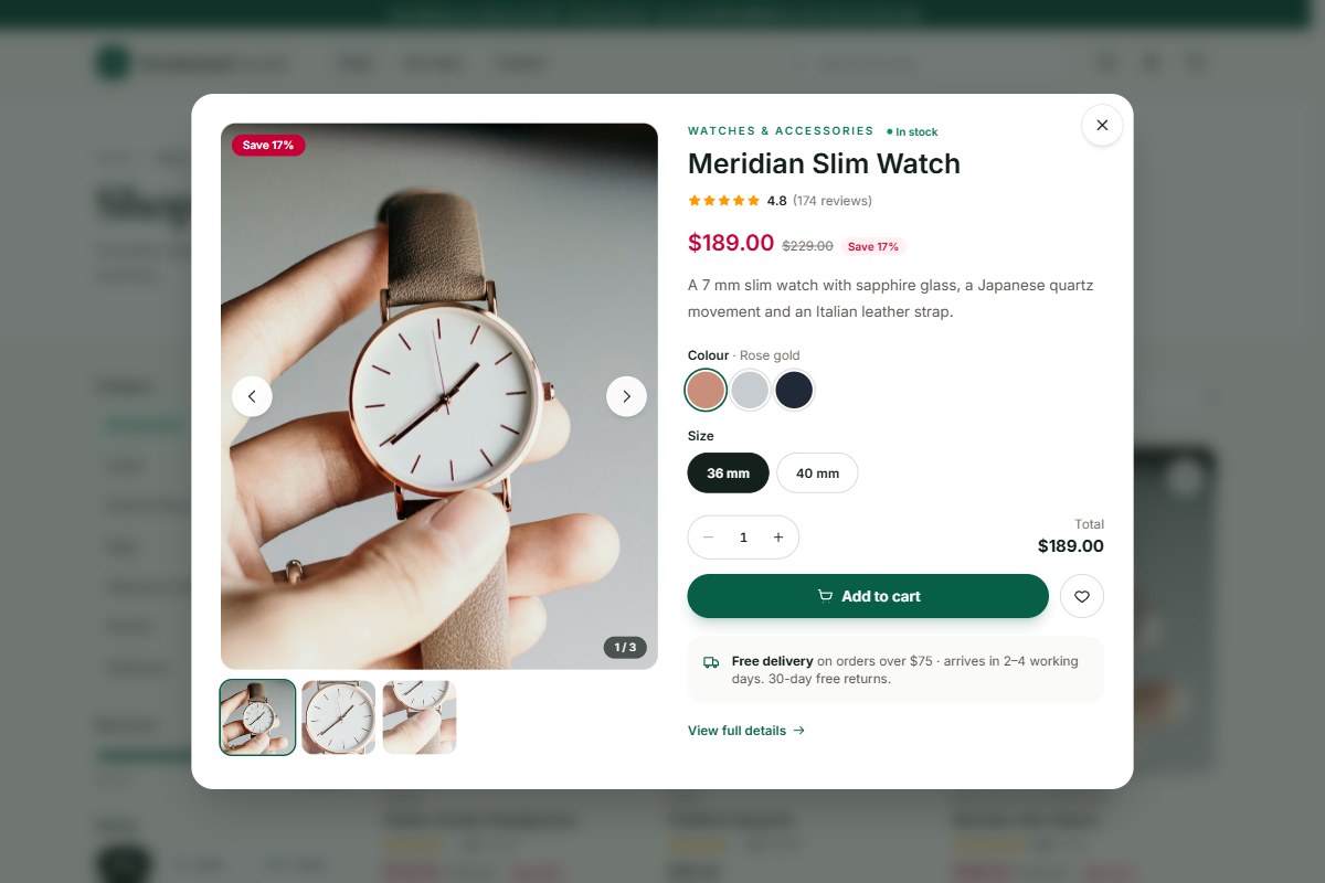
- Product quick view that opens any product in a dialog without leaving the page.
- Cart, wishlist, sign-in and order history kept in one small store and saved in the browser.
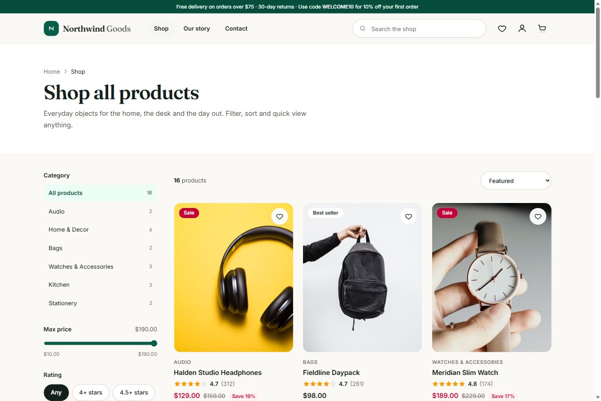
- Shop filters: search, category, maximum price, rating and an on-sale switch, with five sort orders and a filter drawer on phones.
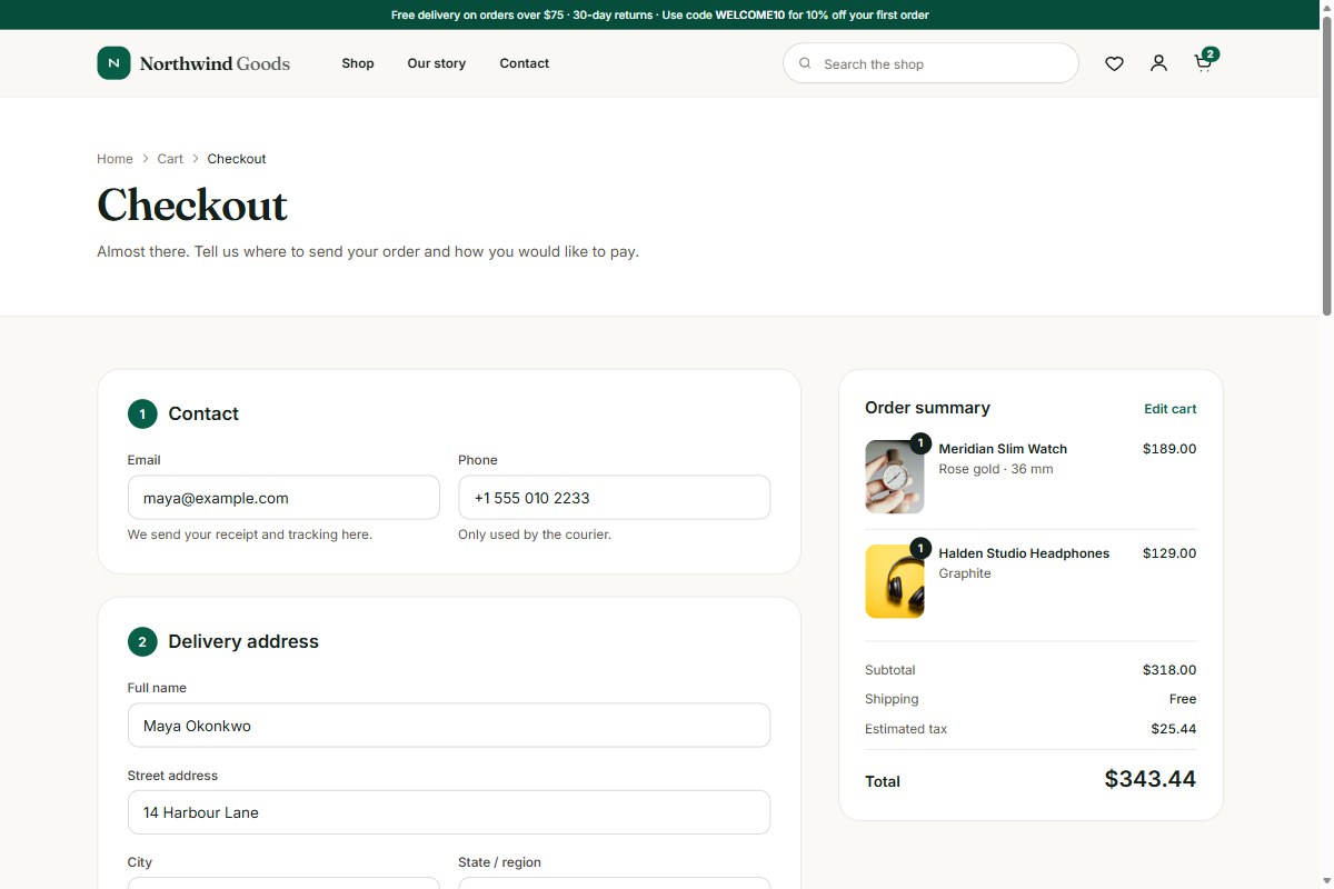
- Validated checkout with delivery options, promo codes and a clear order summary.
- Design tokens for colour, fonts and spacing defined once in the Tailwind theme.
The ten pages
| Page | Route | What it does |
|---|---|---|
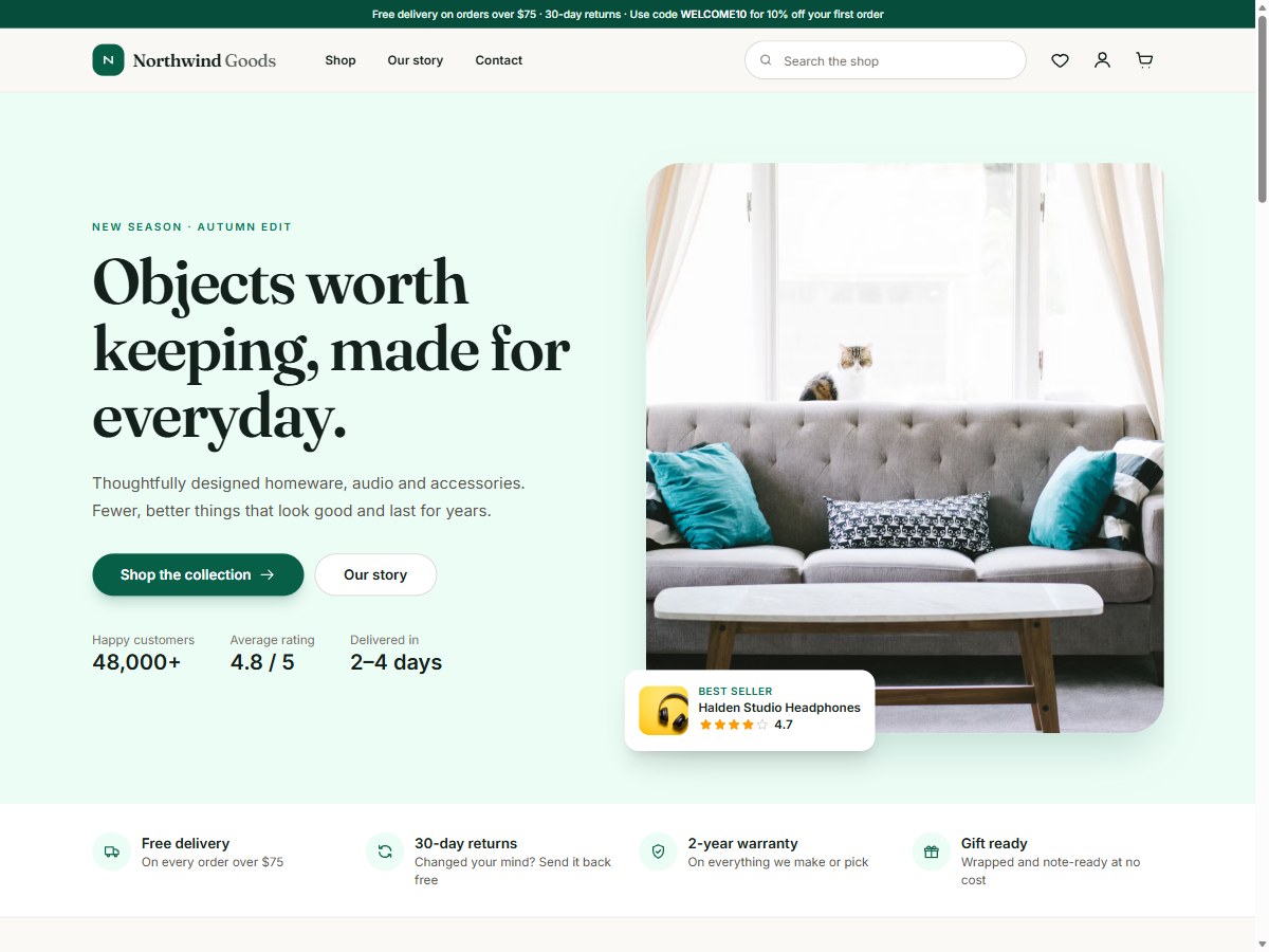
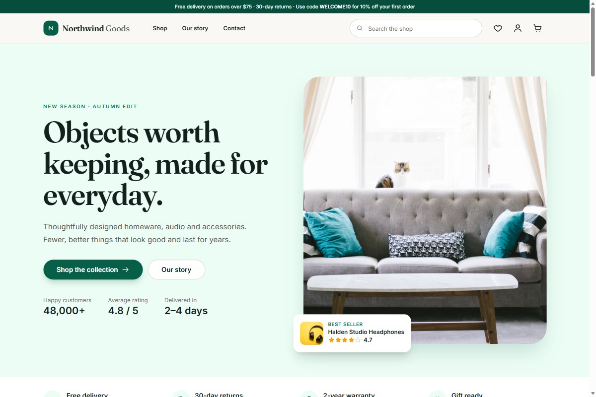
| Home | / | Hero, category tiles, featured products, promo banner, testimonials and newsletter sign-up |
| Shop | /shop | Product grid with search, filters, sorting and a mobile filter drawer |
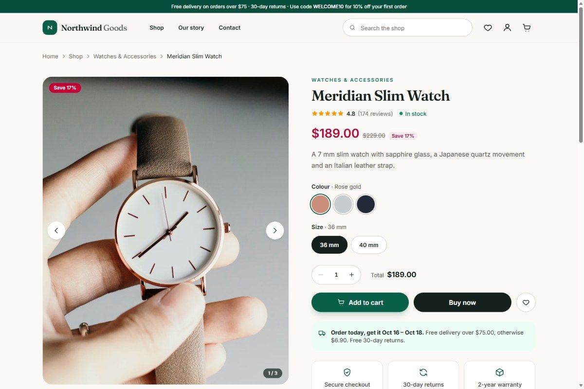
| Product | /product/:slug | Gallery with zoom, colour and size pickers, tabs, reviews summary and related products |
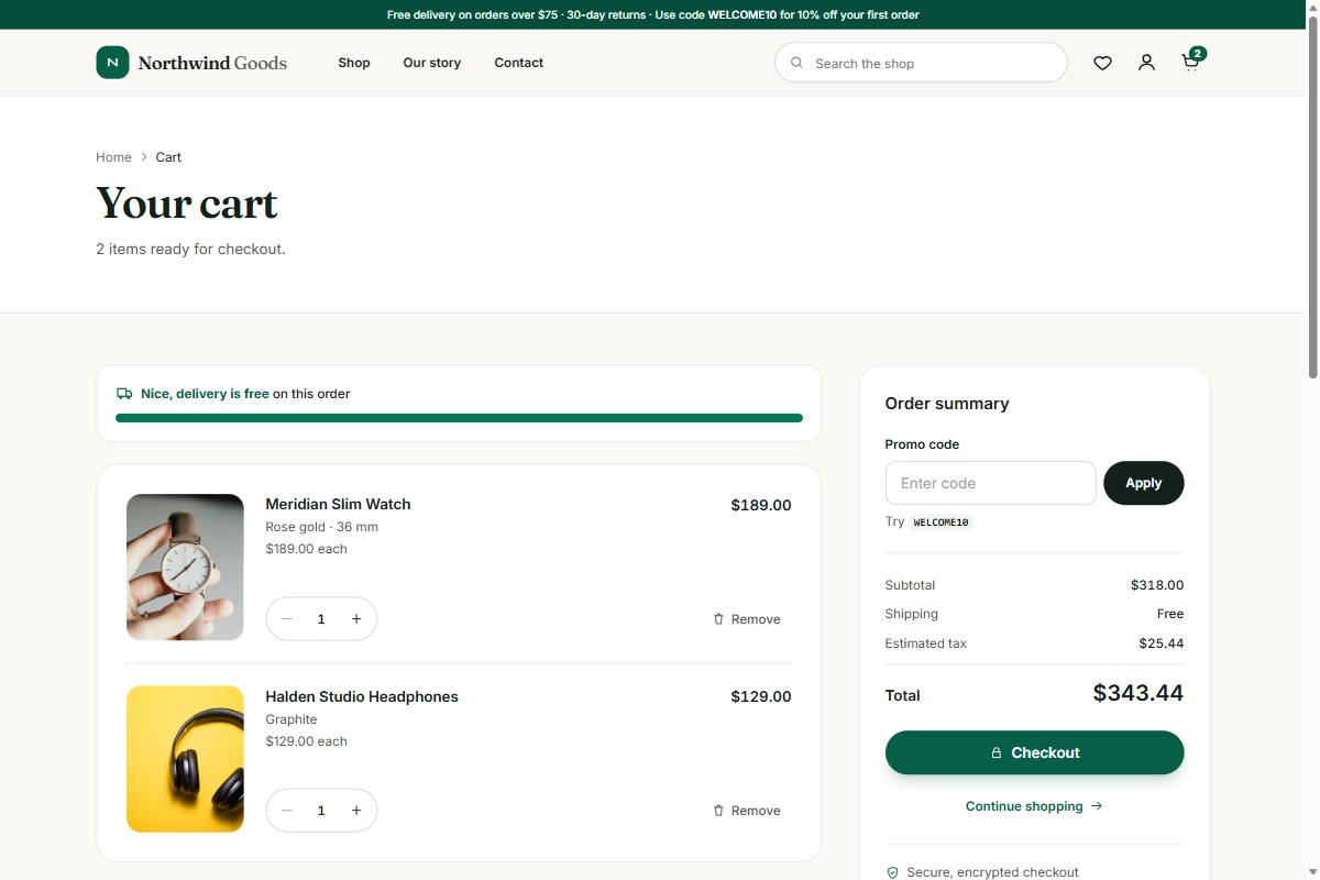
| Cart | /cart | Quantity editing, free-shipping progress, promo code and order summary |
| Checkout | /checkout | Contact, delivery and payment form with inline validation |
| Order success | /order-success | Confirmation with the items just ordered and what happens next |
| Wishlist | /wishlist | Saved products with add to cart |
| About | /about | Brand story, values, stats, timeline and team |
| Contact | /contact | Validated contact form, details and an FAQ |
| Account | /account | Sign in or create an account, order history and sign out |
Product quick view
The quick-view dialog is a real React component, mounted once and opened from anywhere with openQuickView(product). It is built to be used with a keyboard and a screen reader.
- Photo gallery with thumbnails, arrow keys and pointer zoom
- Colour and size pickers, quantity stepper and live total
- Add to cart with a confirmation state, plus wishlist
- Focus is trapped inside the dialog, Escape closes it, and focus returns to where you were
- The page behind is locked from scrolling and hidden from assistive technology while it is open
Built with
- React 19 and React Router 7
- Vite 7 for fast development and small production builds
- Tailwind CSS v4
- No UI framework lock-in and no runtime dependencies beyond React and the router
Get started
- Unzip the download and open the folder in a terminal (Node.js 20.19 or newer).
- Install the packages with
npm install. - Start the dev server with
npm run dev. - Create the production files with
npm run buildand upload thedistfolder to any static host.
Hosting in a sub-folder? Build with VITE_BASE=/my-store/ npm run build. If your host cannot send unknown paths to index.html, build with VITE_HASH_ROUTER=true to use #/ URLs instead. A ready-made .htaccess example is included.
Customise it
- Brand and colours: edit the theme block in
src/index.css. - Products: edit
src/data/products.jsor load products from your own API. - Images: one
img()helper builds every image URL, so you can point it at your own files or CDN. - Shipping and tax: three constants in
src/lib/format.js.
Connect your backend
The demo has no server. All state lives in src/context/StoreContext.jsx, so that is the one place to plug in your API for products, orders and authentication. The payment fields in the checkout are layout only and never leave the page: use your payment provider's hosted fields or checkout page before taking real payments.
What is included
- Full React source code for all ten pages and the shared components
- Vite and Tailwind configuration with a lockfile for repeatable installs
- A README with setup, customisation and hosting notes
- A host rewrite example (
.htaccess) for clean URLs
Photos and fonts
Demo photography loads from Unsplash under the free Unsplash License. Replace it with your own before launch. The fonts, Inter and Fraunces, come from Google Fonts under the SIL Open Font License.
See the license terms for what the Regular and Extended licenses cover.
- 10 production-ready pages: Home, Shop, Product, Cart, Checkout, Order success, Wishlist, About, Contact and Account
- Accessible product quick-view modal with gallery, zoom, colour and size pickers and quantity stepper
- Persistent cart, wishlist, sign-in and order history, all kept in one small store
- Shop with search, category, price and rating filters, sorting and a mobile filter drawer
- Validated checkout with order summary, shipping and tax rules in one place
- Responsive from 360px, keyboard friendly, focus-trapped dialogs and reduced-motion support
- React 19, React Router 7, Vite 7 and Tailwind CSS v4, with no UI framework lock-in
- Free Unsplash product photography, easy to swap for your own
- Sub-folder and hash-router builds for any static host
Reviews
No reviews yet. Be the first to review this product!
Questions & answers (0)
Sign in to ask a question.
No questions yet. Be the first to ask!